
Modules
Studio
Studio is Tylode's design tool for presentations, documents, social media posts and print pieces. You start from a format or a template, design on a canvas, present full screen and export to PDF, PNG or PowerPoint, using your own data and your brand's colors and fonts.
On a phone, a design opens as a list of full-width slides, with Present at the top; tap a slide to present from it. Edit opens the full editor and Done takes you back to the list.
What Studio is
- It's personal. Studio documents belong to you, not to a workspace. They live in My drive next to your files and follow you into every workspace you switch to.
- You share them on purpose. Nobody else sees a design until you share it with Share (see Share a design).
- It works with the rest of Tylode. Charts and tables can pull data from your databases, and slides can show your pages and boards live.
Open Studio in the Personal group of the sidebar. Your latest designs also show up on Home.
Start screen
The start screen has three parts.
Recent
Your last eight designs, at the very top, each with a thumbnail of its first page. Click one to open it. See all in My drive takes you to My drive, where all of them are.
What do you want to make?
Pick a category on the left: Presentation, Document, Social media, Print or Custom size. Each format shows its size in pixels and what it's for. Click one to create a blank design with those dimensions; it opens in the editor straight away.
Social media and Print can be filtered: All, Instagram, Facebook, LinkedIn, X, YouTube, TikTok, Pinterest, WhatsApp and Tylode for social media; Marketing and Cards & stationery for print.
For Custom size, type the Width and Height (between 100 and 10,000 pixels per side) and click Create design.
Templates on the start screen
Finished designs with sample content, grouped into Presentations, Documents and Résumés. Click one to create a new design with its content, then change the text. Designs with a crown (👑) are Premium designs. Basic and saved by you opens the Start from a template window (see Templates).
Formats
There are 27 formats: 26 fixed sizes plus a custom size. Sizes are in pixels; print formats export to PDF at their real physical size.
| Format | Category | Size (px) | Notes |
|---|---|---|---|
| Presentation 16:9 | Presentation | 960 × 540 | For projecting and sharing on screen |
| Presentation 4:3 | Presentation | 960 × 720 | Projectors and older screens |
| A4 document | Document | 794 × 1123 | 210 × 297 mm, several pages |
| Letter document | Document | 816 × 1056 | 8.5 × 11 in, several pages |
| Résumé | Document | 794 × 1123 | A4, with résumé templates |
| Square post | Social media | 1080 × 1080 | Instagram, LinkedIn, Facebook |
| Story 9:16 | Social media | 1080 × 1920 | Stories and Reels, TikTok, WhatsApp |
| LinkedIn post | Social media | 1200 × 627 | Landscape |
| X post | Social media | 1600 × 900 | 16:9 |
| Cover | Social media | 1200 × 630 | Header image for links |
| Portrait post 4:5 | Social media | 1080 × 1350 | Instagram and Facebook feed |
| Facebook post | Social media | 1200 × 630 | Landscape |
| Facebook cover | Social media | 1640 × 624 | Page or profile header |
| LinkedIn banner | Social media | 1584 × 396 | Profile header |
| X header | Social media | 1500 × 500 | Profile header |
| YouTube thumbnail | Social media | 1280 × 720 | Video thumbnail |
| YouTube banner | Social media | 2560 × 1440 | Channel header; keep the key parts centered |
| Pinterest pin | Social media | 1000 × 1500 | Portrait 2:3 |
| A3 poster | 1123 × 1587 | 297 × 420 mm | |
| A2 poster | 1587 × 2245 | 420 × 594 mm | |
| A5 flyer | 559 × 794 | 148 × 210 mm | |
| A4 flyer | 794 × 1123 | 210 × 297 mm, single-sided | |
| Business card | 321 × 208 | 85 × 55 mm, two sides | |
| Invitation | 480 × 672 | 5 × 7 in, portrait | |
| Postcard | 559 × 397 | 148 × 105 mm, two sides | |
| Certificate | 1123 × 794 | A4 landscape | |
| Infographic | 800 × 2000 | Tall, made for scrolling | |
| Custom size | – | 100 to 10,000 per side | Any size you need |
Studio names the units of each format the way you'd expect: presentations have slides, documents and print pieces have pages, social media formats have designs, and business cards, invitations and postcards have sides. The buttons change accordingly (Add slide, Add page, Add side…).
Change the format of a design
The Format menu in the editor's top bar shows the current format. You can switch an empty design to any other format on every plan. Resizing a design that already has content to another format, with everything rearranged to fit, is a Premium feature Premium. On other plans, start a new design in the format you need.
Templates
Ready-made templates
Studio includes 20 templates designed for 16:9 presentations and A4 documents:
| Presentations | Documents | Résumés |
|---|---|---|
| Investor pitch | Project report | Résumé with sidebar |
| Quarterly report | Formal letter | Classic résumé |
| Class or lesson | Invoice | Modern résumé with header |
| Thesis defense | Project proposal | Technical résumé |
| Sales proposal | Meeting minutes | Creative résumé |
| Product launch | Newsletter | Entry-level résumé |
| Employee onboarding | ||
| Creative portfolio |
Use them from the start screen (creates a new design) or from the editor with Design, on the right-hand rail, which opens Templates. In the editor, pick a template and click Add {n} pages to add all its pages, or Add this page for just one. They're added after the current page; if the current page is empty, they replace it. The panel only offers templates that match the current canvas size.
Premium designs Premium
Ten more elaborate designs, marked with 👑. You can preview them on any plan; using them requires Premium.
- Presentations: Annual report, Luxury brand deck, Annual marketing plan, Visual university lecture.
- Documents: Agency proposal, Services brochure, Executive data report.
- Résumés: Executive résumé, Medical and research résumé, Chef résumé.
Start from a template and My templates
Basic and saved by you, on the start screen, opens Start from a template:
- Start from scratch: four simple 16:9 presentations (Project pitch, Report, Lesson and Minimal) built from layouts and palettes.
- My templates: the designs you've saved as templates, marked Saved by you.
To save your own, open a design and choose Export and more → Save as template. It saves a copy as a template; the original stays where it is. Clicking a template creates a new design with its content.
The editor
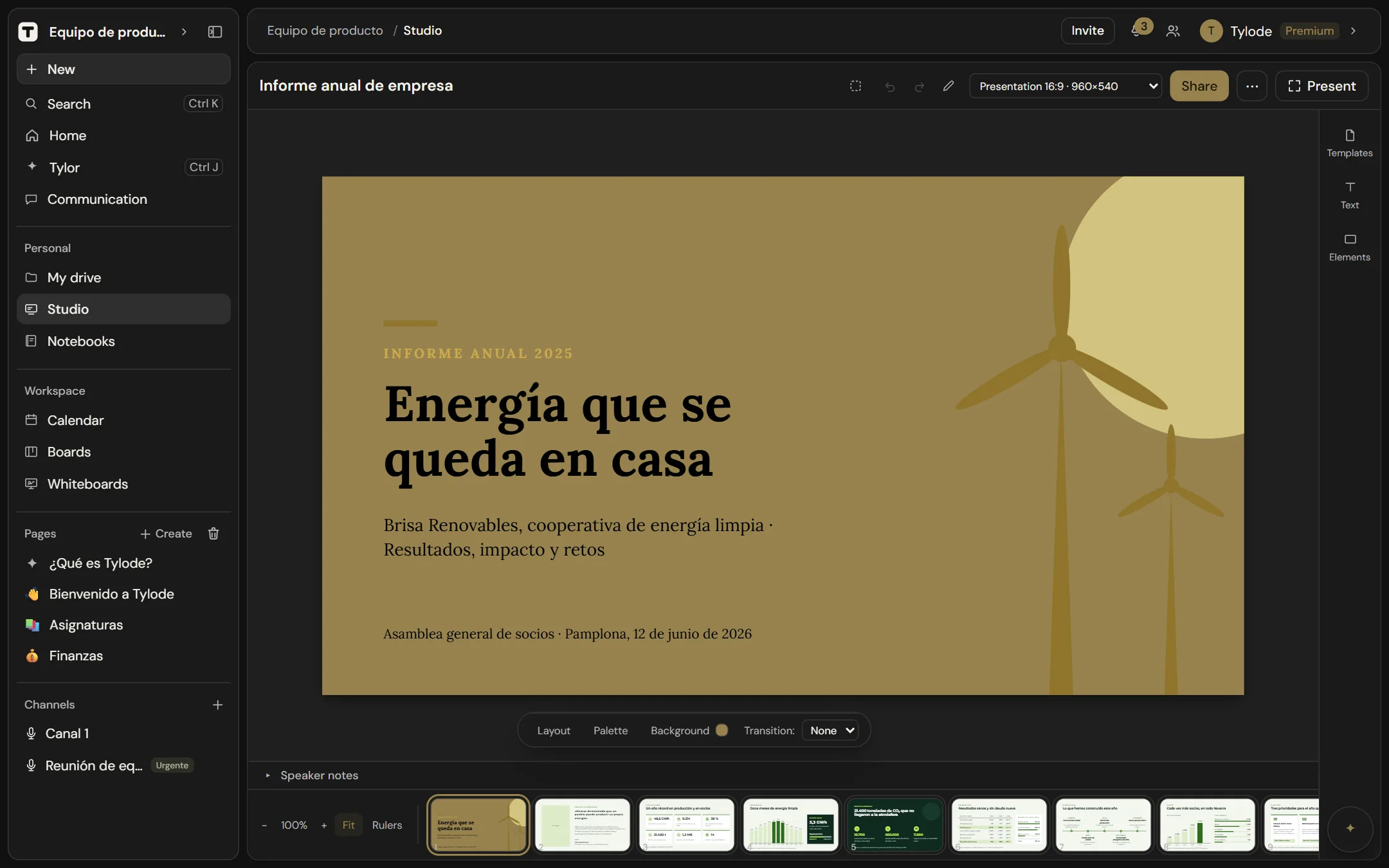
The editor has the canvas in the middle and, right above it, a row with the properties of whatever you have selected. At the bottom, a bar with the slide or page thumbnails, zoom and rulers. On the right, the rail with Design, Elements, Text, Media, Data and Layers. At the top, a bar with undo and redo, Draw, the shortcuts ?, Format, Share, Export and more (⋯) and Present.
To make room for the canvas, the Tylode sidebar collapses when you open a design. Open it with the button at the top left if you need it; when you leave the editor, it goes back to how you had it.
Everything saves automatically as you work. If someone else changes something different on the same element at the same time (you move it while they change its color), both changes are kept. If a change can't be saved (for example, because you've lost your connection), Not saved appears at the top. Studio tries again on its own every few seconds and as soon as the connection is back. While the notice is showing, closing the tab or leaving asks you to confirm.
Slides and pages
Use the thumbnail strip to move between slides or pages. Add slide, Duplicate slide and Delete slide (or page, design or side, depending on the format) manage them; drag a thumbnail to reorder. A design always keeps at least one.
Blank page
An empty page tells you where to start, with three buttons in the middle of the canvas:
- Add text: adds a text box.
- Upload an image: pick an image from your computer.
- Browse elements: opens Elements in the rail.
You can also drag images from your computer and drop them on the canvas, on any page, empty or not. They're uploaded to My drive and placed on the page. Anything that isn't an image is ignored.
The rail
The rail is on the right of the editor. Each button opens its panel to the left of the rail, which stays visible so you can jump from one to another without closing anything.
| Button | What it opens |
|---|---|
| Design | Templates: finished designs to add to your document (see Templates). |
| Elements | Shapes, emojis, stickers, icons and frames, with search. |
| Text | Text presets, styles with effects and font pairings. |
| Media | Images, videos, audio and Your images. |
| Data | Tables, charts, QR codes, Tylode pages, boards and databases, and Batch. |
| Layers | Shows or hides the layers panel (see Layers). |
Elements
If your workspace's brand kit has a logo or signature, Your brand appears at the top with Logo and Signature to drop them in with one click.
Below it is the search box (Search shapes, emojis, icons…). It searches shapes, emojis, stickers and icons at once. Inside a section, it searches only that section.
Then come Recently used (the last things you added in this browser) and these sections, each with See all to see the whole list:
| Section | What it has |
|---|---|
| Shapes | Rectangle, Ellipse, Triangle, Diamond, Star, Arrow and Line. |
| Emojis | 1,593 emojis, grouped into Smileys and emotion, People, Animals and nature, Food and drink, Travel and places, Activities, Objects, Symbols and Flags. Search them by name, in English or Spanish. People and hands come in a skin tone: click the hand next to Emojis and pick one of the six; it stays picked for next time. |
| Stickers | 24 drawings with a white outline, like a die-cut sticker: Burst, Speech bubble, Heart, Star, Crown, Check, Confetti, Seal and more. |
| Animated | Pick an animation (Float, Pulse, Sway, Spin, Bounce or Glow) and click a sticker or an emoji: it lands on the page already moving (see Animations). |
| Icons | 1,942 line icons. They have English names, and the search also understands the most common Spanish words, like "casa", "corazón" or "flecha". When you select one you can change its color and stroke width. |
| Frames and grids | Shapes that hold a photo: Square, Rounded, Circle, Arch, Leaf, Triangle, Diamond, Hexagon, Star, Heart and Blob, plus Grids of 2 to 6 photos. Drop an image on a frame to put it inside; double-click to reframe it. |
Emojis and stickers have two more options in the properties row: Outline adds or removes the white sticker outline, and Motion picks an animation that repeats (or Still).
Text
- Text presets: Title, Subtitle, Body text, Pull quote and Caption.
- Styles with effects Premium: ten ready-made text styles: Neon, Retro, Outline, Sunset, Ocean, Elegant gold, Signature, Sale poster, Editorial headline and Chalk.
- Font pairings: a title and subtitle in fonts that go together: Editorial, Clean, Poster, Classic, Impact, Friendly and Magazine. The ones with a crown (Impact, Friendly, Magazine) need Pro Pro.
- Empty text box: a text with no style. You can also add one by pressing T.
Media
| Element | What you get |
|---|---|
| Images | Upload an image, or pick one with From My drive. |
| Videos | A video from My drive, or a YouTube link Premium. Videos play when presenting; the editor shows a thumbnail. |
| Audio | Upload audio (MP3, M4A, WAV or OGG) with Upload audio, or choose a file with From My drive. It plays when you present; the editor shows a card with its name. When exporting to PowerPoint you get the frame with the name, without the sound. |
Below them, Your images shows the last 24 images you've uploaded to Studio or My drive, with a thumbnail. Click one to place it on the page, at its real proportions. You only see your own.
Data
| Element | What you get |
|---|---|
| Tables | A table of the size you choose, or one filled from a database with Bring from Tylode (see Charts and tables with your data). |
| Charts | Columns, Bars, Lines, Area, Pie or Donut, with sample data or from a database. |
| QR codes Premium | A QR code for a Link, Text, Wi-Fi (network name and password, or No password), Email or Phone, with its own Color and Background (or Transparent). |
| Tylode pages | A page from your workspace, shown live and read-only. |
| Boards and databases | A board or a database from your workspace, shown live and read-only. |
| Batch | One design for each row of a list (see Batch). |
Layers
Layers shows a floating panel, at the top right of the canvas, with every element on the slide, from front to back. Click one to select it. Drag them to change which is in front, use Show/Hide or Lock/Unlock on each one, and double-click a name to rename it. Click Layers again to close it.
Drawing
Click Draw (the pencil in the top bar) to draw freehand on the canvas with a Marker, Highlighter or Pencil. Choose the Size and a color (or Other color), and click Done or press Esc to finish. Each stroke becomes an element you can move, resize or delete.
Properties row
Above the canvas there's a fixed row:
- With something selected, it shows its options.
- With nothing selected, it shows the page's options: Layout, Palette, Your brand, Background and Transition: (see Backgrounds).
The row always keeps the same height, so the canvas doesn't jump when you select or deselect, and it never covers what you're editing.
Next to the selected element there's also a mini bar with three buttons: duplicate, lock or unlock, and delete.
The bigger options open in the side panel:
| Panel | What you can change |
|---|---|
| Color | Solid colors, Gradients, Colors in this design, your Brand kit colors, a hex code (try "#0ea5e9"), Pick an exact color or the Color wheel. |
| Border | Border color, Border thickness and, for shapes, Corner radius. |
| Font | Fonts grouped into Sans serif, Serif, Display, Handwriting and Monospace, with search, your brand's fonts and Your fonts (see Custom fonts). |
| Effects | For text: Basic effects (None, Soft shadow, Hard shadow, Outline, Poster, Glow) and Advanced ones Pro (Neon lights, 70s, TV static, Screen print, Graffiti, Cosmic). Fine-tune Shadow (color, Opacity, Blur, Distance, Direction) and Outline (Thickness, color), or Reset. Shapes have Fill and Shadow. |
| Table | Rows, columns and look (see below). |
| Chart | Type, data and legend (see below). |
| Animation | Opens with Animate: the entrance animation and the one that repeats while visible (see Animations). |
| Position | Align and distribute (see Arrange elements). |
Text also has quick controls: Text color, Font, Size, Bold, Italic, Underline, alignment (left, center, right), Line spacing, Letter spacing, Bulleted list, Numbered list and Fit the font size to the box, which shrinks or grows the text to fill its box. Double-click a text box to type in it.
Images
Drag an image to move it, like any other element. Select it to:
- Crop: drag to choose the part you want and click Apply. For a quick crop you don't need to go in: dragging a side of the selected image crops it from that side, without stretching it, up to its edge.
- Adjust: apply a filter (Original, Vivid, Soft, Black and white, Sepia, Cool, Warm, Faded) and fine-tune Brightness, Contrast, Saturation, Grayscale, Sepia, Hue and Blur. Remove adjustments undoes them.
- Give it a frame shape: open Elements, click See all in Frames and grids and tap a shape with the image selected. Remove the shape puts it back as it was.
- Link: where the image goes when clicked while presenting (see Links).
Images you upload are saved to My drive (see Where images are stored) and show up in Media → Your images so you can reuse them.
Backgrounds
Click an empty part of the canvas so nothing is selected; the row above the canvas shows the page's options. Background lets you set the slide or page background to:
- Color: any solid color.
- Gradient: Sunrise, Ocean, Forest, Night, Paper or Peach.
- Pattern: Dots, Grid, Lines, Diagonals, Checkerboard or Crosses, with pattern (Ink) and Base colors and Size.
- Image: Upload image, then choose how it fits: Cover, Fit whole or Tile.
Remove background goes back to the default.
Layouts, palettes, brand and transitions
The same row has:
| Option | What it does |
|---|---|
| Layout | Six slide layouts: Title slide, Title and content, Two columns, Section divider, Quote and Image and text. A layout replaces what's on the slide, so it asks you to click again to confirm. |
| Palette | Six color palettes for the current slide: White, Charcoal, Indigo, Sand, Forest and Wine. |
| Your brand Pro | Applies your brand kit's colors and fonts to the slide. |
| Transition: | How the slide appears when presenting: None, Fade, Slide or Zoom. |
Charts and tables with your data
Charts and tables can take their data from a database in your workspace.
- Open Data in the rail and pick Charts (or Tables).
- Under Bring from Tylode, pick a database. For a chart, choose the chart type first.
The element shows "Imported from {database}". For charts, What's plotted lets you choose the text column for Names and up to four number columns for Values (one for pie and donut charts); Show turns on Legend, Percentages (pie and donut) and Values on top. For tables, you can set Header row (bold first row with a background), Banded rows, colors, Border and Header background, and add or remove rows and columns.
A slide only has so much room: if the database is big, Studio brings in the first rows and columns that fit and tells you how many were left out. The rest stays in your database.
Refresh data fetches the current data from the database again. For tables, it replaces anything you've typed in the table.
To use sample data instead, choose Insert with sample data and edit the values by hand.
Pages, boards and databases on a slide
Tylode pages and Boards and databases, under Data, put a live, read-only view of that page, board or database on the slide. It's read again every time the design opens; Read it again now refreshes it if you've just changed something in another tab. People who open the design without access to the original won't see its content. You can't edit the original from the slide.
Animations
Select an element and click Animate in the properties row. The Animation panel has two parts.
Entrance animation: how the element appears when presenting.
- Featured: None, Simple, Elegant, Playful, Corporate, Relaxed and Spotlight.
- Basic: Rise, Drop, From the left, From the right, Fade and Zoom in.
Adjust Direction, Speed (Slow, Normal, Fast, Very fast) and Starts after (in milliseconds) to build a sequence. Entrance animations play when you present, not in the editor.
While visible: an animation that repeats for as long as the element is on screen. Choose Still (no animation), Float, Pulse, Sway, Spin, Bounce or Glow. It works with any element.
- You see it in the editor and when presenting.
- When you export, the element comes out still.
- If "reduce motion" is turned on in your system, it doesn't move.
Move, resize and rotate
- Move: drag any element, images included. Hold Alt as you start dragging to take a copy and leave the original where it was.
- Resize: a selected element has eight handles, on the corners and the sides. Each one stretches the way it points, even when the element is rotated. The corners follow the element's Proportion; the sides only stretch toward their own side. On an image, the sides crop it instead of stretching it; with Shift, they scale the whole image.
- Hold Shift while resizing to free or keep the proportions, and Alt to grow from the center.
- Rotate: drag the rotation handle; hold Shift for 15° steps.
- While you resize or rotate, the size (width × height) or the angle shows next to the pointer.
- Snapping: with the element unrotated, when you stretch it without keeping proportions, the side you're dragging snaps to the edges and centers of the other elements, to the edges and center of the page, and to the guides.
- Several at once: with several elements selected, a shared frame with four corners appears. Drag a corner to scale them together, in proportion, text size included. Hold Shift to stretch them without keeping proportions.
On touch screens, the handles are twice as big when you use your finger.
Arrange elements
| Tool | How it works |
|---|---|
| Rulers | Turn rulers on in the bottom bar. Drag from a ruler to create a guide; drag a guide off the canvas to remove it. |
| Align and distribute | With one element selected, it aligns to the canvas: Left, Center, Right, Top, Bottom. With several, they align to each other. Distribute Horizontally or Vertically spreads three or more elements evenly. |
| Group | Group (they move and rotate together) joins the selected elements; Ungroup separates them. Also with Ctrl+G and Ctrl+Shift+G. |
| Lock | Lock or unlock stops an element from being moved by accident. Also with Ctrl+Shift+L. |
| Order | Ctrl+] brings forward and Ctrl+[ sends backward, one step. With Shift, all the way to the front or back. You can also drag in Layers. |
| Proportion | Locked: the element scales as a whole. Free: it stretches on each axis. Hold Shift while resizing to switch temporarily. |
| Zoom | Zoom in, Zoom out and Fit (fit to window) in the bottom bar, or pinch on a trackpad. |
On touch screens, one finger moves things and two fingers zoom. Turn on Select with finger in the top bar to box-select several elements with your finger (a pen always box-selects).
Batch
Make a design once and create a version for every row of a list: a post per product, a certificate per student, a poster per event. Open Data on the right-hand rail and click Batch; the ? next to the title sums it up. It takes three steps.
Start from the list
If you have the list in front of you, click Batch in the database header. Choose the format and which rows and click Open in the Studio: a new design is created already connected, with a title (the first text column), the next column that says something and, if the list has an image column, a frame with each row's photo. It opens with this panel showing, at step 2.
1. Pick the list
Choose a database from your pages (they're grouped by workspace and page): each row becomes a design. Below it you see its first rows, so you can check it's the right one.
In the dropdown keep All rows or choose Only the ones in the … view: only that view's rows are used, with its filters and in its order. To use another list, click Change; to remove it, Disconnect.
2. Mark what changes
Click the text or image in the design that changes from row to row and, under Fill with, choose the column. Whatever changes gets a tag with its column name and is listed under Changes in each design.
While the panel is open, the design shows real data. In the Showing bar above the canvas, use ‹ and › to move between rows.
- Texts: to make a text stay the same again, choose Nothing: the same in all. To mix fixed text and columns ("New: Blue mug, for €12"), open Mix fixed text and columns and click the columns: they're added to the text in braces, like
{Product}, and when editing it you can move them and type around them. They also work inside tables. - Images: choose an Image column or The row's cover. If a row has no image, the design's image stays.
- With nothing selected, you can add a new text with a column or, if the list has an Image column, click + Photo (with the column's name): a frame appears already linked, showing each row's photo in its design. Move and resize it like any image.
- Dates and numbers appear as they're written in your language, selects with their label, ticked checkboxes as ✓, and formulas calculated. A number next to a currency symbol ("{Price} €") shows two decimals when it isn't whole: 3.80 €. Person and relation columns can't be used.
- If a value doesn't fit its text box, the font shrinks so it fits.
- If a text asks for a column that no longer exists (for example, because you renamed it), the panel warns you and it appears as it is.
3. Create the designs
Click Create N designs and choose:
- PDF: a document with one page per row. If the design has several pages, each row's pages come one after another.
- Images: a ZIP with one PNG image per row and page, named after each row.
- RRSS Planner: one post per row with its image (a carousel if the design has several pages). You choose the account, the networks (Instagram and LinkedIn), the start day, which weekdays and at what time: one goes out per day, in the order of the rows. The post text also accepts columns in braces, and posts are saved as Draft or For review. You need the RRSS Planner extension and an account you can post to.
The data is read when you create, so it's always up to date. On Free, up to 10 designs are created at a time and images carry the "Made with Tylode" mark; on Pro and Premium, up to 100 and without the mark.
Keyboard shortcuts
Press ? in the editor, or the ? in the top bar, to see the shortcuts cheat sheet without leaving the design. On Mac, use Cmd wherever the table says Ctrl and Option wherever it says Alt.
Edit:
| Shortcut | Action |
|---|---|
| Ctrl+Z | Undo |
| Ctrl+Shift+Z or Ctrl+Y | Redo |
| Ctrl+C / Ctrl+X / Ctrl+V | Copy, cut and paste |
| Ctrl+D, or Alt+drag | Duplicate |
| Delete / Backspace | Delete |
| T | Add text |
Arrange:
| Shortcut | Action |
|---|---|
| Ctrl+A | Select everything on the slide |
| Shift+click | Add an element to the selection, or remove it |
| Tab / Shift+Tab | Select next or previous |
| Ctrl+G | Group |
| Ctrl+Shift+G | Ungroup |
| Ctrl+] | Bring forward |
| Ctrl+[ | Send backward |
| Ctrl+Shift+] | Bring to front |
| Ctrl+Shift+[ | Send to back |
| Ctrl+Shift+L | Lock or unlock |
Move and transform:
| Shortcut | Action |
|---|---|
| Arrow keys | Move 1 px |
| Shift+arrow keys | Move 10 px |
| Shift while resizing | Keep or free proportions |
| Alt while resizing | Resize from the center |
| Shift while rotating | Rotate in 15° steps |
View:
| Shortcut | Action |
|---|---|
| Ctrl++ / Ctrl+- | Zoom in and out |
| Ctrl+0 | Fit to screen |
| Esc | Leave the group or deselect |
| ? | Show these shortcuts |
When presenting:
| Key | Action |
|---|---|
| → or Space | Next slide |
| ← | Previous slide |
| Esc | Exit the presentation |
Present
Click Present to show the design full screen. Move with the keys above, the ← Previous and Next → buttons, the mouse wheel or a two-finger swipe on the trackpad. Transitions and animations play, YouTube videos play, and elements with a link follow it when clicked. Exit (Esc) returns to the editor.
Links
Any element can take you somewhere when presenting: select it and click Link in the toolbar (for an image, in its controls). Choose where it goes:
- Web: an
https://address, opened in a new tab. - Tylode: a page, board or whiteboard from your workspace, or another of your designs, opened in a new tab. Search by name; each one shows what it is on the right. If the presenter can't open it (for example, in a design copied from another workspace), the link stays inactive.
- Slide: another page of the same design, which you jump to on click. Useful for menus and tables of contents.
To remove it, click Remove at the bottom of the panel. When exporting to PowerPoint, links travel as hyperlinks on images and shapes.
Speaker notes
Below the editor's canvas there's Speaker notes: click it to write what you want to remember when presenting the slide you have open. Each slide has its own, they save automatically and they only appear in presenter view, never in what the audience sees. Anyone who can view the presentation can read them. Duplicating a presentation copies its notes too.
Presenter view
Export and more → Presenter view opens a second window, meant for your own screen, with:
- the current slide and its number ("Current slide (3/12)"),
- a preview of the Next slide (or Last slide),
- the speaker Notes for the current slide,
- a timer counting from when you opened it,
- ← Previous and Next → buttons.
The presenter view and the full-screen presentation stay in sync: move forward in either and the other follows. Put the full-screen presentation on the projector or shared screen and keep the presenter view on yours.
Export
Open Export and more (⋯) in the top bar:
| Option | Result | Plans |
|---|---|---|
| Export to PDF | One slide or page per sheet, at the exact canvas size. | All |
| Export to PNG | The current slide or page, at double resolution. | All |
| Export to PPTX | "Editable in PowerPoint, Keynote or Google Slides". | Pro and Premium Pro |
On the Free plan, PDF and PNG exports carry a small "Made with Tylode" watermark. Pro and Premium exports have no watermark.
What PowerPoint export loses
The .pptx is downloaded, and Studio then lists anything that didn't translate:
- Slide transitions aren't exported.
- Line spacing and letter spacing aren't exported.
- Gradients come out as a solid color.
- Cropping and image adjustments are baked into the image and can't be undone in PowerPoint.
- Embedded boards and databases come out as a table, with the data as of the export.
- Flipping on some shapes isn't exported.
- Videos from My drive aren't embedded: a frame with the file name takes their place. YouTube videos do play.
- Occasionally an image, an icon or an embedded board or database can't be included; the list tells you when.
Share a design
Studio documents are private until you share them with a link. Open the design and:
- Click Share.
- Choose the Permission (Can edit or Can only view), how many Uses the link has (Once, As many as you say… or Unlimited) and when it Expires (In 1 day, In 7 days or Never). The default is can edit, once, 7 days.
- Click Create link and copy it and send it to whoever you want.
Whoever opens the link with their Tylode account goes straight in to the design. If they're not signed in, they sign in or sign up first and come back to the link automatically. Each new person uses up one use; opening it again when you already have access doesn't count. An expired or used-up link says so and gives no access.
The same panel lists the Links that are still active, with their uses and expiry, so you can Copy them (on a phone or tablet, in the browser, also Share…, which opens your device's share menu) or Revoke them, and the People with access, whose permission you can change or Remove. Revoking a link doesn't take access away from people who already joined with it: do that under "People with access". Only the owner can share.
People with Can edit open the design in the editor; people with Can only view open it as a presentation they can page through but not change. They'll find it under Shared with me in their My drive. Only you, the owner, can delete it.
Editing together
When two people have the design open, each sees the other's changes right away: text, positions, styles, new or deleted slides. At the top, next to Share, you see the initial of whoever else has it open. Whatever you have selected doesn't move while you're working on it: the other person's change lands when you let go. If you both change the same element at once, the last save wins.
Brand kit Pro
The brand kit keeps your workspace's brand ready to apply to any design in one click. Set it up in Settings → Workspace → Brand kit.
| Section | What you set |
|---|---|
| Logo and signature | Logo: a PNG with a transparent background. Signature: your scanned signature as a PNG, for letters, invoices and proposals. Use Upload image, Change image or Remove. |
| Text | For Title, Subtitle and Body: the font, Color and Bold. |
| Colors | Document background (the background of every page), Surface (panels, bands and large blocks), Shapes and frames (small shapes and outlines) and Accent (lines, icons, labels and details). |
| Supporting colors | Extra colors that show up in Studio's color panel but aren't applied automatically. |
| Brand fonts | Upload your own fonts: TTF, OTF, WOFF or WOFF2, up to 5 MB each and 20 at most. Tick the box confirming you have a license to use the font on the web, share it with the workspace and use it in exported documents. Google Fonts are already in Studio and don't need uploading. |
A preview shows how your documents will look.
- Who can edit it: only an owner or an admin of the workspace, and the workspace needs a Pro or Premium plan. Everyone else sees it read-only.
- Who can use it: in Studio, Your brand in the page row applies the colors and fonts, the logo and signature appear at the top of Elements, and the brand colors appear in the Color panel. Applying the brand requires your account to be on Pro or Premium. Brand fonts can be picked by everyone in the workspace.
Custom fonts Pro
Besides brand fonts, you can upload fonts just for yourself. In the Font panel, under Your fonts, click Upload font (.ttf, .otf, .woff) (WOFF2 also works; up to 5 MB). Only you can see them: anyone who opens a shared design without the font sees a fallback font instead. To remove one, use Remove this font.
Plan features
Studio features depend on your account's plan, not the workspace's.
| Feature | Free | Pro | Premium |
|---|---|---|---|
| All formats, templates, charts, tables and embeds | ✓ | ✓ | ✓ |
| Export to PDF and PNG | With watermark | ✓ | ✓ |
| Export to PPTX | – | ✓ | ✓ |
| Advanced text effects and crowned font pairings | – | ✓ | ✓ |
| Custom fonts | – | ✓ | ✓ |
| Apply the brand kit | – | ✓ | ✓ |
| Premium designs | – | – | ✓ |
| Styles with effects | – | – | ✓ |
| Resize a design that has content to another format | – | – | ✓ |
| YouTube videos | – | – | ✓ |
| QR codes | – | – | ✓ |
When you try a feature your plan doesn't include, Studio tells you which plan includes it, with a link to the plans. Anything already applied keeps showing and exporting. See Plans.
Where images are stored
Images you upload in Studio, including background images, are saved to your My drive, just like any other file. They count toward the storage of the workspace you're in when you upload them, and your plan's file size limit applies. Studio documents themselves also appear in My drive, where you can organize them in folders, move them to the trash and restore them.